

INPS is rewriting Public Administration texts to make them accessible to everyone. Giacomo Grassi talks about readability metrics, user validation, and artificial intelligence in the service of citizens.
Accessibility in public digital services is not just a technical or regulatory matter: it is a cultural choice that has a direct impact on the daily lives of millions of people.
I had the opportunity to discuss this topic with Giacomo Grassi, one of the most authoritative voices in Italy on accessibility, particularly within Public Administration.
Giacomo Grassi has over ten years of experience designing digital products and services for major international brands such as Ferrari, Armani, Vodafone, Sky and many others. He was Head of UX and Design at Yoox and led Vodafone's internal design studio, serving more than 30 million users. Today, as the INPS executive for User Experience and Digital Process, he is redesigning the country's digital services. From the Sirio Design System to the citizen-driven rebranding, and on to projects applying AI to text simplification and the governance of AI adoption within INPS, he is simplifying access to public services for millions of citizens. The projects he has led have received major international awards, including the iF Design Award, Red Dot Design Award, ADI Design Index, Compasso d'Oro (Honourable Mention) and EPSA Good Practice Certificate.
In this conversation we will talk about text accessibility, administrative language and readability measurement, but also about artificial intelligence as a concrete tool to improve people's experience. A discussion that brings out not only the project, but also the method, the organizational challenges and the value of design as a systemic lever.
We thank District for putting us in touch with Giacomo Grassi, and Giacomo himself for taking part in this exchange of ideas and for so generously sharing the behind-the-scenes of his work.
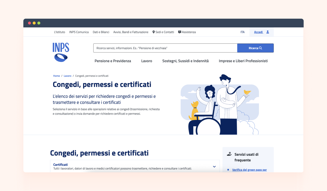
Sara: I think dealing with INPS services written in a complex way — trying to figure out what to do and how to reach your goal — is an experience shared by a large part of the Italian population. I'm curious: before your intervention, why were the texts so complex? Why wasn't there much attention to making them understandable?
Giacomo: This is one of the central points of the project. The complexity of Public Administration texts stems from several factors.
The first is certainly cultural. Public Administration has historically used language very close to that of law and regulation: formal, technical, institutional. It is a long-established tradition, which for a long time was considered almost natural. The administration spoke that way, and citizens often had to interpret that language with the help of intermediaries, support centres, professionals or more experienced people.
The second element, however, is even more significant: the texts of a public administration don't only have an informative function, but must also maintain formal correctness and legal value. When describing a benefit, a requirement or a procedure, it must be done precisely, avoiding ambiguity and possible misinterpretations. From this point of view, technical-legal language was long perceived as the safest way to protect the Institution.
The problem is that this language, while rigorous, is not always accessible. If a person is not familiar with certain terms, certain syntactic structures, or the way administrative texts are built, comprehension can become difficult.
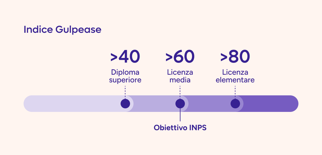
For us this could not be a reason not to act — quite the opposite. We started measuring the readability of texts, also using the Gulpease index, and we found that much of the content aimed at citizens required, on average, a higher level of education, with some cases that were even more complex. It was from this evidence that the simplification work was born: maintaining technical and legal correctness, but making texts clearer, more readable and genuinely more accessible to people.
Sara: But not all of the Italian population reaches that level.
Giacomo: Certainly not everyone reaches that level, and that is exactly the point.
INPS effectively serves a very broad and diverse audience. That's why we set ourselves a measurable goal: to bring texts aimed at citizens at least to a readability threshold compatible with a lower secondary school education. It's a reasonable threshold, because it corresponds to the level of compulsory schooling and is a concrete reference point for making information understandable to a much larger share of the population.
In technical terms, the jump needed is about 10 points on the Gulpease index. It may sound abstract, but it actually has a very concrete impact: moving, for example, from 50 to 60 points means making that content more accessible to millions of people.
Of course, it's not enough to make a text “simpler” in a generic sense. The challenge is to keep technical and regulatory correctness while reducing the effort needed to understand what you're reading and what you have to do. In this sense, readability is not just a stylistic quality: it is a condition for effective access to services.
Sara: Do you have data on the educational level, command of Italian and digital literacy of your users? Which I imagine corresponds to almost the entire adult Italian population.
Giacomo: Our user base largely coincides with the Italian population. INPS serves citizens, workers, pensioners, businesses, intermediaries — people in very different circumstances. So, when we work on text accessibility, we have to consider an extremely broad and heterogeneous audience. That's why we chose the lower secondary school threshold as our first reference.
That said, it is certainly not a definitive end point. The more we increase the clarity and readability of texts, the more we widen people's ability to truly understand the information we provide. This helps not only those with lower levels of education, but also non-native Italian speakers, users with cognitive difficulties, citizens in complex situations, or simply people who, at that moment, need to quickly understand what to do.
In this sense, simplifying means reducing the effort needed to get your bearings, understand your rights, grasp a procedure and correctly access a service — indirectly increasing, as well, trust in institutions.
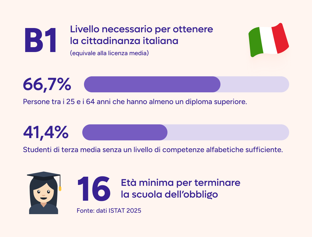
Source: ISTAT 2025 data
Sara: Have you considered doing it for specific services? For example, a service for applying for citizenship is probably aimed at someone with a lower level of Italian.
Giacomo: Yes, that's certainly an interesting direction: adapting the level of clarity and accessibility to the specific characteristics of the audience a service addresses. It's a more precision-oriented approach, which could make a lot of sense in a later phase.
In this first phase, however, we faced a very broad problem: an enormous amount of content to make clearer and more accessible. That's why we chose to maximize impact by acting first on the content and services that could generate the most widespread benefit.
Working at INPS, something very interesting emerges: the classic 80-20 Pareto logic doesn't always apply [Editor's note: The Pareto principle states that roughly 20% of causes produce 80% of effects. In design it is used to focus efforts on the few elements that generate the greatest impact for users — for example, optimizing the most-used features instead of perfecting everything uniformly]. In many contexts you expect a few services to concentrate most of the traffic, and therefore the impact. In our case, however, the situation is far more nuanced: one of the first things I tried to do — and which took longer than expected — was to line up all the digital services INPS provides, nearly 500 of them, ranking them by traffic. The idea was simple: identify the ten most-used services, intervene there, and solve the problems of a huge share of users.
Well, at INPS it doesn't work like that.
When you put those services on a graph, ordered by usage volume, you don't find a few peaks and then emptiness. You find a very long tail. This means the Institute speaks to many different audiences and offers very specific services, often relevant to numerically smaller groups of users, but for whom that service is essential.
So it becomes hard to reason only by averages or to imagine solving everything by focusing on a few “big” services. Either you tackle horizontal problems that cut across the whole ecosystem — such as language, accessibility, consistency, usability — or, if you intervene on a single very specific problem, you are inevitably speaking to a limited audience at a time.
Sara: When you started this project, did you have to face internal resistance? Many designers who have had to deal with texts written by legal teams — it happened to me, for instance, with a bank — know that convincing the legal team to do simplification work is not exactly easy.
Giacomo: Yes, we had difficulties and we still do. But it's important to clarify that it isn't simply resistance to change: behind it lies a precise responsibility, namely ensuring that a text remains correct from a technical, administrative and regulatory standpoint.
Sara: That's understandable — they have to guarantee that the text holds a certain legal value, so they want to be as safe as possible.
Giacomo: Exactly. Whoever oversees those texts is responsible for them. If a designer comes along and says “now let's rewrite it this way because it's simpler,” on the other side there's someone who can legitimately reply: “no, because responsibility for the content remains mine.”
That's why it's a topic that must be addressed together, not in opposition. It has to be a collaborative, four-handed effort. We bring method, metrics, attention to comprehensibility and to the user's experience; the competent units guarantee technical and regulatory correctness. In our process, in fact, final validation stays with whoever is responsible for the content.
The same applies to experimentation with artificial intelligence: human-in-the-loop is indispensable. AI can help enormously to produce first drafts, speed up the work and propose more readable texts, but it doesn't replace human expertise in validation.
Naturally, there's no magic solution. You also need determined governance. At INPS this was possible because the Institute's leadership strongly believes in the value of simplification, and that makes a huge difference.
Then there are also small organizational changes that, in practice, become major achievements. One example is “silence-as-consent” on certain non-particularly-sensitive content areas: we produce a simplified version, send it for review, and if we receive no specific observations within a certain deadline, we can proceed with publication. It seems like a detail, but it changes a great deal, because it makes the process faster and more sustainable.
Sara: Do you have any advice on how to use the Gulpease index?
Giacomo: Yes. The Gulpease index is a very useful tool, not least because it's simple to apply. There are various online tools; today we use one developed in-house, but in theory you can even calculate it with an Excel spreadsheet. At its core is a formula that mainly considers word length, sentence length and the overall number of sentences in the text.
In practical terms, the index tends to improve when sentences are shorter and when the words used are shorter, and when the text is organized in a more linear way, avoiding too many asides, parentheses, subordinate clauses and very long sentences.
The interesting thing is that the evaluation doesn't get into the meaning of the words or the specific content. It measures structural elements of the text, and yet the result is very effective. If you take a very discursive text, with long, elaborate sentences, and reorganize it more clearly — perhaps also using bullet points — the index rises noticeably.
And the important thing is that this improvement doesn't stay purely theoretical. When you then test those texts with users, it normally emerges clearly that the text with a higher index is also the one that is easier to read and understand.
Sara: Did you validate the comprehensibility of the revised texts with users?
Giacomo: Yes. At the beginning, also to move quickly, we relied on the literature and on readability metrics. After a year, however, we told ourselves it was necessary to verify directly with users whether the simplification was actually producing a perceptible improvement. We work on sensitive content, so for me it was essential not to stop at technical measurement alone. So we launched a test with a panel of about 1,600 users.
The interesting part is that there is no simple, well-established way to ask a user whether one text works better than another. We made a first attempt comparing pairs of texts: we had people read the original text first, then the simplified one and — without revealing which was the original and which the simplified version — we asked some comprehension questions. The result, however, was essentially null: the two texts appeared almost equivalent.
At that point there were two possibilities: either the simplification work was producing no real effects, or the test wasn't set up correctly. Fortunately, the second hypothesis turned out to be the right one.
So we redesigned the evaluation with an approach closer to an A/B test. We showed users two versions of the text and asked which they preferred, then adding qualitative assessments on aspects such as fluency, simplicity, clarity, tone and naturalness. In this case the result was very clear-cut: the simplified texts were preferred in 72% of cases.
The main insight is that, in the first test, the question risked determining the answer more than the text itself did. If you ask for a detail that's too specific, the user may get it wrong even after reading a clear text; if instead you ask a question that's too easy, or with very unbalanced options, the answer becomes almost automatic. The A/B comparison let us overcome this problem, because it measures the user's perception of the text's overall quality more directly.
Sara: How did you use Artificial Intelligence within this project?
Giacomo: We used it right inside this work, because the problem was very concrete: simplifying many texts, keeping quality and correctness, in timeframes compatible with the amount of content to manage.
I can say this with a touch of pride and patriotic spirit: comparing notes with international experiences on artificial intelligence applied to the public sector and GovTech, I believe INPS is moving very well. We hold our own, we're carrying forward many interesting projects and, in some areas, we're even quite ahead.
In this specific case, the starting idea was simple: if we have to make many administrative texts clearer, generative artificial intelligence can be a very suitable tool. Of course, it's not enough to “ask the AI to simplify”. We built structured prompts, tested them, corrected and refined them, until we reached a configuration that produced solid results.
We then evaluated the texts using the standard metrics from the literature. We compared three versions: the original text, the text simplified by a human expert, and the text simplified by artificial intelligence. In particular, we measured semantic closeness to the original, the readability index and linguistic variability. This also let us identify the model that performed best among the many available on the market.
The results were very positive. The texts produced by artificial intelligence kept strong semantic adherence to the original text, so they didn't lose relevant content, and at the same time they were more readable, fluent and natural. This is an important point, because simplification must not produce poor or mechanical texts: it must make content more accessible without impoverishing it.
We then also ran a three-way comparison, to understand whether artificial intelligence improved only on the original text or whether it was also competitive with human simplification. On outright preferences, the texts simplified by experts and those generated by AI were very close. On overall qualitative metrics, the AI texts turned out not only to be better than the originals, but in some cases even more appreciated than the manually simplified ones.
Sara: Did you expect this result?
Giacomo: No, not to this extent. I partly hoped for it, because I follow the evolution of artificial intelligence with great interest and I thought that, for an activity of this kind, it could work well. I expected AI-generated texts to be able to improve on the originals. What I didn't expect was that they could compete so well even with simplification done by a human expert.
This result pushed us to go further. We're working on an internal application dedicated to this kind of simplification, and we're also exploring a further step, which for me is one of the most interesting aspects: no longer starting only from an already-written administrative text, but trying to generate a simple text directly from the primary source — that is, from the legislation itself.
The first results are encouraging. Naturally, criteria, parameters, controls and human validation are needed, but the idea is very powerful: using artificial intelligence not only to simplify an existing text, but to help produce clearer, more readable and more accessible content from the very start.
Sara: So skipping the intermediate legal interpretation, starting directly from the text of the law and arriving at the simplified text?
Giacomo: Yes, the point is precisely to shorten the chain, especially when you need to quickly produce new content or update existing content.
Most INPS texts originate from regulatory sources. The path, simplifying, is this: there is a rule, a law, a decree; that source is interpreted and translated into internal documents, such as circulars or messages; then, starting from those documents, the information page that citizens find on the portal is built — for example, to understand how to access a benefit or submit an application.
If we can have a system that works directly on regulatory sources, collected in a constantly updated document repository, we can greatly reduce the time required. The system could quickly produce a first text explaining the service, already consistent with the latest available updates.
The interesting thing is that legal texts, although often hard to read, are highly structured. They may have interpretive margins, of course, but semantically they're built to be precise. This makes them a very suitable source for generating correct content, provided the process is well governed.
Ultimately, the principle “garbage in, garbage out” applies: if the source is weak, the result will be weak too. But a piece of legislation, with all the limits and complexities it may have, is generally a solid, rigorous source, written to define obligations, requirements and conditions precisely. From there you can try to generate a simpler text, while keeping a very reliable informational base.
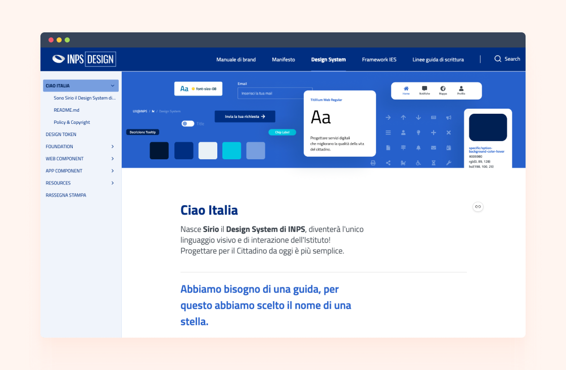
Sara: Coming back to accessibility and INPS's new Design System, was there a moment when you realized that all the work you were doing was actually working and having a real impact on citizens?
Giacomo: Yes, we noticed within a few months. At a certain point we saw a fairly clear leap in the quality of the experience, both in terms of usability and accessibility.
The decisive turning point was the start of the adoption of the Sirio Design System. Sirio was designed, among other things, to meet accessibility criteria and, when it began to actually enter the services, the effect was visible. Within a few months the new portal was built, onto which we grafted Sirio even though that wasn't initially planned in those terms. In the same period, with the strong push of the PNRR (Italy's National Recovery and Resilience Plan), many digital services were being redesigned or updated.
So, almost at the same time, the new portal and several services with the new interface were released. There we began to see very clear signs: more positive comments, improving feedback scores, and above all usability tests that, comparing before and after, showed marked differences.
When so many initiatives reached maturity almost simultaneously, the increase in quality became visible. It was one of the moments when we understood that the change was not just internal or design-related, but was also being perceived by users.
Naturally, the work isn't finished. There are still many services to improve, especially the older ones or those built with previous logic. But in that period we saw clearly that the direction was the right one and that the impact was starting to be recognizable from the outside as well.
Sara: One last question — do you have any advice for those who have to do similar work?
Giacomo: Yes, I'd give a few pieces of advice.
The first is not to think that this kind of expertise exists only outside Italy. In Italy there are very skilled professionals working on these topics. I, for instance, have exchanged ideas several times with Valentina Di Michele, who is certainly a point of reference. And there's also a very competent institutional ecosystem: I'm thinking of the Department for Digital Transformation, with whom we frequently compare notes and who are doing very serious work on many fronts.
But if I had to point out the two most important things for setting up similar work, the first would be measurement. In large, complex organizations it's not enough to say “let's do it because it's right” or “trust me, it'll work.” You have to build projects knowing from the outset how impact will be measured, which indicators we'll use and what improvements we expect to observe. Without measurement, you stay in the realm of opinions.
The second thing is to always work on two levels. On one hand you need to involve the people in the organization, clearly share goals and a long-term vision, bring them into the projects — especially when they're ambitious. On the other hand you need the convinced support of leadership, because without strong governance change risks staying episodic.
You often see very fine projects, even well designed, that nonetheless fail to take root because they worked on only one of these two fronts. Either they have top-down support but can't truly engage the organization, or they're born from the bottom up with a lot of energy but without the strength needed to become structural. When instead these two elements hold together — engaging people and governance sponsorship — then change has a much greater chance of consolidating.
Giacomo's account leaves us with an important lesson: accessibility is not a constraint, it's an opportunity that benefits everyone. When we raise the bar to include those who face the most difficulty, we improve the experience of millions of people. And when we combine rigour in measurement, collaboration across teams and strategic vision from leadership, we can transform even the most complex institutions. A valuable model for anyone who wants to bring sustainable innovation to public services.

Sara is a designer at Buildo, specializing in User Research and UX. Her passion for research enables her to gain a deep understanding of users' needs and translate them into intuitive and user-friendly designs.
Are you searching for a reliable partner to develop your tailor-made software solution? We'd love to chat with you and learn more about your project.

Buildo S.r.l. è certificata ISO 9001:2015 (Sistema di Gestione Qualità) da PJR per la Progettazione e Sviluppo di Software.


