

Chat Isn't Always the Right Modality
Building an AI product? The default answer is almost always “make it a chatbot.” But default doesn't mean right. Here's why chat isn't always the right modality, and how to design AI with intent, not habit.

Building an AI product? The default answer is almost always “make it a chatbot.” But default doesn't mean right. Here's why chat isn't always the right modality, and how to design AI with intent, not habit.
 Livia Stevenin
 Lately there’s a sentence I’m terrified to hear in my meetings: “We want the solution to be a chat.” Sometimes it’s phrased as “an AI assistant,” sometimes as “something with a chat.” The wording changes, but the pattern stays the same: the solution arrives before the problem does.
By now I’ve learned to expect it. The worst part is when you’ve already mapped the flow, understood the need, and arrived at a solution that adapts to it, and the client still feels drawn to a chatbot, because a chat window is the most recognizable face of the technology today.
And I get why it happens. AI can feel like a mystery when you’re not familiar with it, so it’s natural to reach for the one form you’ve already used everywhere else. It’s what “AI” looks like in most people’s heads. So when a client wants to bring AI into their product, a chat box feels like the obvious, safe choice.
But the real goal was never to add a chatbot, but to solve a problem. And chat is just one of many ways to do that, not always the best one. In this article I want to explain why we, as designers, should look beyond “just add a chatbot,” and what we can offer instead when the real answer is something smarter and quieter.
The first issue with a chatbot is that it’s an empty box.
A blank text field gives users almost no guidance. It’s like handing someone a microphone with no script and saying, “go ahead, sing something.” That openness sounds freeing, but in practice it creates hesitation. Users have to figure out what the system can do, how to phrase it, and whether their request will even be understood.
Worse, when someone is in the middle of a task, that empty box becomes a doorway to distraction. Instead of moving through a clear, guided flow, the user is invited to improvise. They wander off, ask something tangential, and lose the thread of what they came to do. A well-designed interface keeps people oriented toward their goal. An open chat, by its nature, keeps asking them to define the goal from scratch every time.
And distraction isn’t the only cost. An empty box also asks a lot of people cognitively. Reducing cognitive load and minimizing unnecessary choices can make experiences far more comfortable, especially for neurodivergent users, and it would be easy to assume a chatbot does this automatically, since it strips the screen down to a single input. But often it does the opposite.
A blank conversational box removes the very things most people rely on to find their way through an interface: clear structure, predictable navigation, and visible boundaries. This isn’t only an accessibility concern. Anyone who isn’t already fluent with these tools, which is still most people, pays the same price. When there’s no layout to anchor to, no obvious “what do I do next,” the openness becomes a burden rather than a relief. Having to compose a request in natural language, guess at what the system understands, and hold the whole task in your head is a real cognitive cost for everyone. An intuitive layout with clear affordances can be kinder than a chat window that assumes everyone is comfortable putting their intentions into words.
In Shaping Interfaces With Intent, I talked about the frustration of rigid, step-by-step interfaces that make people work harder than they should. A raw chatbot can be the opposite failure: so unstructured that users don’t know where to start. Both extremes miss the point. The job of the interface is to guide, not to interrogate.
People treat “AI” and “chatbot” as synonyms. They’re not. A chatbot is one interface pattern, while the capabilities behind it (language models, classification, extraction, prediction, ranking, search, and even the kind of rule-based logic we tend to just call “an algorithm”) can surface in dozens of ways that have nothing to do with a conversation window. The point is to stop equating AI with one chat-shaped interface and to use it in whatever shape actually fits the problem.
Take a task with a single correct answer, where a fixed set of rules decides the outcome. Rule-based, deterministic systems like this are one of the oldest branches of AI, long before chatbots existed, so reaching for one is still an AI choice: the one that fits the task. Wrapping that logic inside a chat window, on the other hand, mostly adds cost, latency, and uncertainty to something that was already solved.
I saw this clearly in a project where we needed to match deals against a set of specific rules. The logic was strict: a deal either satisfied a condition or it didn’t, and the same input had to produce the same result every single time. So we split the flow by what each part needed: deterministic matching logic for the rule checks, where exactness is the whole point, and the language model for the nuanced, language-heavy parts of the same flow. This is still very much an AI product. What changed is where the model sits, and the fact that no part of it needed a chat window to reach the user.
Some of the most satisfying AI work I’ve done had no chat interface at all. Take Lola, a speech-to-form assistant we built. Lola uses real-time speech processing and language models to fill out forms from natural conversation, but the user never stares at an empty chat window. The AI works inside a familiar, structured interface, populating fields, flagging errors.
The model does heavy interpretive work behind the scenes, but the designer’s job is to surface that work through a clear interface, not a conversation. AI can live in a suggestion, a smart default, an autofill, a proactive nudge, a ranked list, an inline validation. The best AI often blends into the background until it’s needed, offering unobtrusive support rather than demanding interaction. That’s often the highest form of AI in a product: capability without a spotlight on itself.

The moment you put a chat box in front of people, you set an expectation that’s hard to meet.
A chat interface looks general purpose. It looks like the assistants people already use in their personal lives. So even if your chatbot was built to do one specific thing, users will inevitably try to make it do other things: ask unrelated questions, request features you never scoped, push it in directions you never anticipated.
You can’t reliably predict how people will use an open text field, because the surface area of “anything they might type” is effectively infinite. And when they hit a wall, when the bot says “I can’t help with that,” the experience turns sour fast. Instead of feeling helped, users feel restricted by a tool that looked like it could do anything and then couldn’t.
A more structured interface avoids this trap entirely. When the available actions are visible and bounded, users understand the scope immediately.
There’s also a real tension here: the wish to make the AI visible. If a client has invested real budget and effort into introducing AI, wanting a return on it, including a return of image, is completely reasonable. The question here is whether a chatbot is the right way to show AI capabilities.
A chatbot added mostly for visibility tends to be shallow and disconnected from what people actually came to do. It doesn’t really showcase the technology; it can quietly signal that the technology wasn’t matched to a real need. But visibility and usefulness don’t have to compete. If the goal is to make the presence of AI legible, there are subtler ways to do it. On one project, for example, we gave every AI-based feature a consistent icon and accent color, so the intelligence in the product was recognizable at a glance, without funneling everything through a chat window. The AI was visible and clearly branded, and it still lived inside interfaces built for the task.
Using AI well is about choosing the moment and the modality where it actually helps, and, when it matters, making that intelligence visible in a way that fits the product.
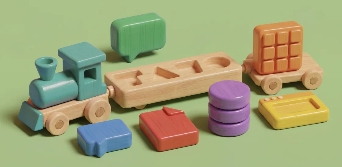
Every AI project I’ve worked on has reinforced the same lesson: the interface is a decision, not a default. Chat is a powerful pattern for open-ended, language-driven, exploratory tasks. It’s a poor fit for structured workflows, deterministic logic, bounded actions, and users who benefit from clarity over openness.
Chat earns its place when people can’t know in advance what they’ll need to ask, when the task is exploratory, like research or brainstorming, and when the conversation itself is where the value lies. If expressing an intent would otherwise take a dozen filters and screens, one sentence typed in a chat may well be the clearest interface you can offer.
In the products we design, this thinking has taken plenty of shapes. On one project, for a diagnostic laboratory, people needed to find specific sets of samples in a huge database, each sample described by dozens of characteristics like material, tube type, or the analyzer used. A chatbot could have taken those requests, but it didn’t fit how they worked: they needed search right next to the table. A separate chat window would have pulled them straight out of that flow.
So instead of a chatbot, we built natural-language search directly into the table. People could type what they were looking for in plain language, and the system translated it into visible filters, applied on the spot, with the matching samples showing up in the table below. They got the ease of describing a query in their own words, while still seeing exactly how it was interpreted, adjusting any filter by hand, and staying in the tool.
Another project called for reviewing long reports for compliance, checking whether each one was complete, properly structured, and written the way the rules required. “Reviewing documents with AI” is exactly the kind of task people imagine handing to a chatbot. But a reviewer doesn’t want to interrogate a bot one report at a time. They want to see, at a glance, what passed, what failed, and where. So the AI ran its checks in the background and surfaced the results as scores and flags placed on the report itself, the issues highlighted where they occurred and the overall conformity visible without anyone typing a question.
In both cases the task could have been a chatbot. The real need called for something else, and that something else was still very much AI. Same underlying models, a very different experience, because the intelligence meets people inside the tool they already know, instead of in a blank window that asks them to start from scratch.
So when a client opens with “we want a chatbot,” I try to gently rewind to the question that should come first: what are users actually trying to do, and what’s the best way to help them do it? Start from the real need, not the shape of the solution. More often than not, the answer still fits the brief exactly; it just lives outside the obvious box.
The most impressive thing we can build is a product that solves the problem so smoothly that no one stops to notice the AI at all: people just get where they were going, faster and with less friction. That’s what good AI design looks like to me.
Livia is a designer at Buildo with expertise in UI, UX, and design systems. Her Brazilian background brings cultural diversity and perspective to the team. She is driven by her passion for research and for collaborating with others to deliver top-quality projects.
 Livia Stevenin Livia Stevenin — 8 min
  Livia Stevenin Livia Stevenin — 12 min
  Livia Stevenin Livia Stevenin — 7 min
 It’s called Newslettero, and each month we share useful reads and fresh ideas, the kind of stuff we'd actually want to read ourselves.