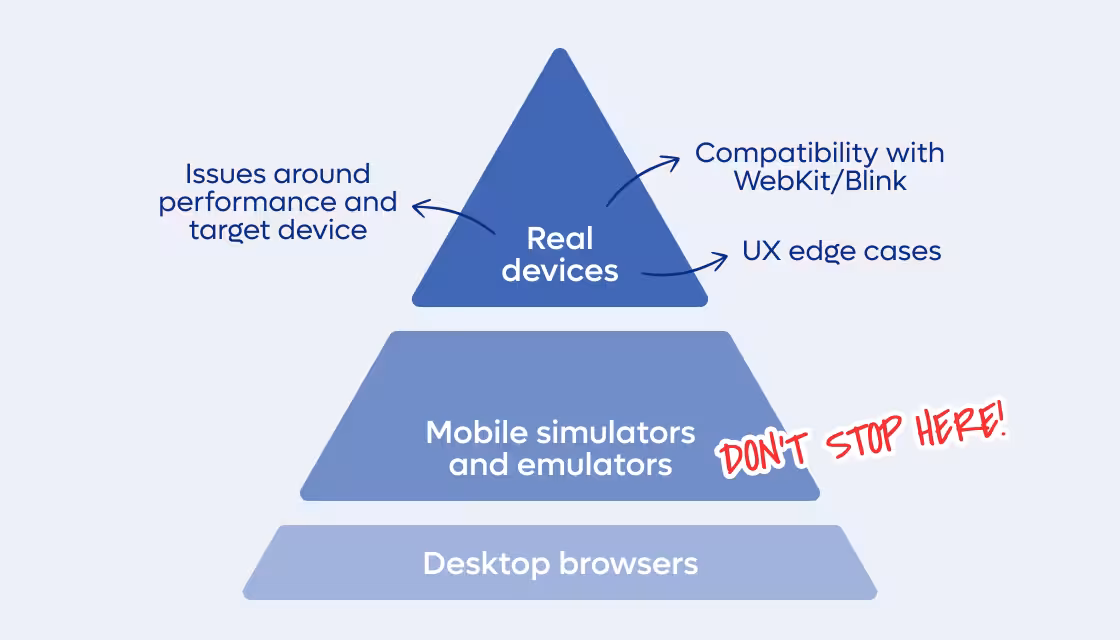
Simulated viewports miss real UX and OS compatibility issues. This is how we run Playwright tests on real Android & iOS devices with BrowserStack.
It happens to the best of us: you pour your heart into building and testing a web application, basking in the green glow of passing tests after a careful Test Driven Development (TDD) cycle, hit deploy, and proudly show off your shiny new e-commerce site to your auntie on her old iPhone X… only to watch the layout fall apart.
Real-device testing has a knack for surfacing the most subtle, unexpected bugs. On a recent project, an extensive Next.js application for a major project, we aimed to enhance the reliability of our Playwright component tests by integrating BrowserStack’s real-device testing cloud. The process came with its fair share of joys and pains, and we thought it was worth sharing what we learned.
It’s well known that most users today land on websites via mobile browsing, using a wide variety of devices and browsers. Relying on simulated viewports alone can easily hide issues such as:
Some might argue that this level of reliability is just a “nice-to-have,” since achieving it requires significant effort from developers.
However, in reality, that same effort (if not more) will eventually be spent fixing the very same issues when they surface during User Acceptance Testing (UAT) or, worse still, after release. At that stage, the process becomes heavier of course: a user reports a bug, a ticket gets created and assigned, the issue is reproduced, fixed, tested again, and finally patched into the app.
That’s why, in my opinion, it’s worth it for everyone involved. Your sweet auntie included.
Even better, you don’t need to reinvent the wheel: you can reuse your existing component tests and run them directly on real devices, with almost no extra effort compared to running them in a simulated or emulated environment.
Long story short, BrowserStack is one of the few cloud-based platforms that maintains a remote device farm. The service isn’t exactly cheap, as it’s primarily targeted at enterprises, but its mechanics are pretty interesting (at least from what I’ve gathered by stalking their support team).
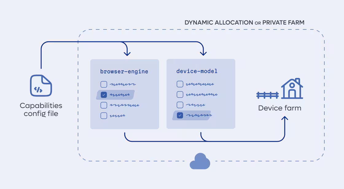
There are two main ways to invoke BrowserStack’s capabilities, and both require you to define the paired device/browser configuration in your browserstack.yml(here’s mine), where you specify the exact combination you want to run your tests against and the number of workers you require to run parallel tests.
The first method, the easiest to apply to an existing test codebase, allows BrowserStack to run tests against your app whether it’s hosted locally, in a private environment, or within a CI setup. A secure tunnel is established to provide access, letting you watch your tests execute directly against your localhost setup.
The second approach is to run your tests directly against the public URLs of your deployed app. This naturally fits into a post-deployment testing phase in your CI pipeline. Once your app is live on a staging or production environment, BrowserStack can immediately run your suite against real devices and browsers, eliminating the need for tunneling. It’s a straightforward way to validate that what just got deployed actually works in the wild.
In both approaches, BrowserStack’s servers receive your list of required devices, query a global index to check device availability, and then allocate matching nodes in their infrastructure for your “build” (their term for the version of your app under test). From what I’ve learned, if you request 5 parallel workers on the same device type, the system will attempt to allocate 5 distinct physical devices to run those tests in parallel.
Of course, to reduce contention with other users, BrowserStack also offers a higher-priced private device farm, where specific devices are reserved exclusively for your organisation.
One concrete example of the kind of real-world issues we uncovered with BrowserStack came up while testing on an iPhone 15: the entire app crashed because of an incompatibility between Safari and the AbortSignal.timeout() browser API. We had been using it in all our fetch calls, assuming broad support, but it turned out that WebKit only introduced this feature starting with version 16, as you can check yourself here. So, despite our passion for adopting the latest APIs, we were obliged to implement a custom function as a workaround.
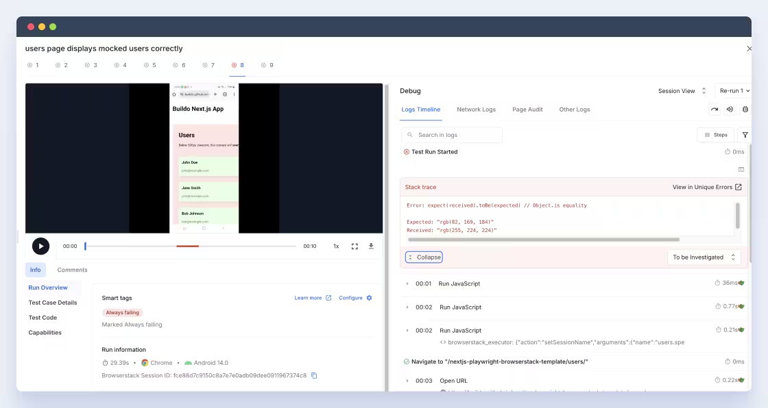
Another example of a bug that slips past simulated viewports can be found in the repository template I created for the occasion of a demo. The page includes a deliberate layout overflow that breaks the UX on devices with a viewport width under 500 px. If the overflow occurs, the background turns red; otherwise, it stays blue. The single test in the repository checks precisely that; it asserts the component’s background color to verify the absence of overflow:
  const bgColor = await page.evaluate(() => {
    const el = document.querySelector('[data-testid="overflow-container"]');
    return el ? getComputedStyle(el).backgroundColor : null;
  });
  expect(bgColor).toBe("rgb(82, 169, 184)")
})
Here’s the twist: the test passes perfectly when run locally with Playwright across its predefined “mobile devices”, yet it fails on BrowserStack for all of those same real devices. The simulated environment simply doesn’t reproduce the subtle pixel behavior that the actual hardware does.
Because when Playwright “runs on an iPhone,” it’s not really running on one: it’s rendering inside a Chromium engine configured to imitate the iPhone’s screen characteristics. The key difference lies in how the browser interprets hardware-bound pixels versus simulated pixels.
On a real device, the Device Pixel Ratio (DPR) is a measured value derived from the display's physical pixel density and the device’s system-level scaling. It can be fractional (e.g. 2.25 on Firefox for Android, or 3.00 on Safari for certain iPhones) and can even vary depending on zoom level or OS accessibility settings. This value defines how many physical pixels correspond to one CSS pixel, and it directly influences layout rounding, sub-pixel rendering, and overflow behavior.
Playwright, on the other hand, doesn’t have access to real display hardware. It applies a deviceScaleFactor, which is simply an emulated DPR baked into a static descriptor. That factor, which in Playwright’s world can only be an integer, tells Chromium to pretend its device pixel grid has a certain density (let’s say for example, 3×) and to expose window.devicePixelRatio = 3 to JavaScript. But underneath, it’s still rendering on your laptop’s display resolution, not the target device’s hardware.
The result is that Playwright’s viewport is rounded to discrete steps and idealized. It rounds both the CSS viewport and the scaling factor. Those minor discrepancies can easily be the difference between a passing and a failing responsive layout test.
The configuration process is a pain. I won’t sugarcoat it. BrowserStack’s SDK evolves quickly, and in just six months, I’ve already seen at least five updates. By the time you’re reading this, my configuration sample might be outdated. Still, it’s a solid starting point if you ever need a working baseline. If it helps you, leave me a ⭐️ on the repo! It keeps me motivated (and slightly less grumpy about YAML files).
Pricing is another consideration. It’s not the cheapest option out there, but somewhere in the mid-range compared to similar real-device testing services. On the bright side, their support team deserves credit: technical chat requests usually get a reply within 24 hours, which is a lifesaver when you’re debugging for days.
If you’ve gone through this journey yourself, maybe you’ve wired up Appium, Sauce Labs, or another real-device grid. I’d love to hear how you’ve managed it.
What pain points did you hit? Did you find any clever ways to keep configs future-proof?
Real-device testing catches what simulators can’t: browser quirks, OS mismatches, and device-specific bugs that directly affect your users. Tools like BrowserStack add some cost and setup friction, but they save you from chasing issues later in the UAT or production environment. If reliability matters, running your tests on real hardware is one of the most valuable steps you can take, for you and your dearest auntie.

Andrea is a full-stack developer with a background in art and design, bringing creativity and originality to every project. Self-taught and driven, she approaches challenges with pragmatism, curiosity, and determination.
Are you searching for a reliable partner to develop your tailor-made software solution? We'd love to chat with you and learn more about your project.

Buildo S.r.l. è certificata ISO 9001:2015 (Sistema di Gestione Qualità) da PJR per la Progettazione e Sviluppo di Software.


