

Building a configurator for a benchtop robotic workstation for clinical laboratories meant tackling complex drag-and-drop challenges. DnD-kit was our weapon of choice: from basic setup to mixing multiple patterns in one interface.
We recently built a web-based configurator for a benchtop robotic workstation system, the kind you'd find in clinical laboratories. Users needed to drag rack modules into trays, preview how they'd fit, reorder them, and manage multiple configuration profiles. Simple enough, right? Well, not quite.
The challenge wasn't just making things draggable. We had to handle slot constraints (racks come in different sizes and need to fit within available space), fence compatibility (adjacent racks need matching connectors), real-time validation (users shouldn't be able to drop a rack where it won't fit), and mixed interaction patterns (some areas allow reordering, others only swapping). All of this in a React application that needed to feel responsive and intuitive.
We chose DnD-kit for the job, and while it turned out to be an excellent choice, the journey involved some interesting discoveries and a few hard-learned lessons. Here's what we learned building this configurator.
Note: This article covers @dnd-kit/core (v6.x) and @dnd-kit/sortable, which are now considered the legacy version of DnD-kit. A new framework-agnostic rewrite is in active development — with adapters for React, Vue, Svelte, and Solid — but has not yet reached a stable 1.0 release (currently v0.3.x). The patterns described here remain the standard approach for production use.
We started with @dnd-kit/core, the foundational package that provides the building blocks for drag-and-drop interactions. Our initial approach was straightforward: use useDraggable for the rack items in the location drawer and useDroppable for slots in the trays where racks could be placed.
We created a DroppableSlot component between each lane in the tray, effectively turning every gap into a drop target. When you dragged a rack from the drawer, you'd drop it into one of these slots, and we'd insert it at that position. The code looked something like this:
// Simplified version of our first approach
function Tray({ lanes, onAddLane }) {
  return (
    <div className="tray-grid">
      {lanes.map((lane, index) => (
        <>
          <DroppableSlot
            index={index}
            onDrop={(item) => onAddLane(item, index)}
          />
          <Lane lane={lane} />
        </>
      ))}
      <DroppableSlot
        index={lanes.length}
        onDrop={(item) => onAddLane(item, lanes.length)}
      />
    </div>
  );
}

function DroppableSlot({ index, onDrop }) {
  const { isOver, setNodeRef } = useDroppable({
    id: `slot-${index}`,
    data: { index }
  });

  return <div ref={setNodeRef} className={isOver ? 'highlight' : ''} />;
}
This worked, but it felt clunky. Every time we wanted to reorder an existing rack, we had to manually calculate indices, handle the removal from the old position, and insert at the new position. There were no smooth animations when items shifted around, and the code was getting verbose with all the manual slot management.
After the initial implementation, we knew there had to be a better way. We dove into DnD-kit's examples to see how others were handling similar problems. One example in particular was quite insightful, it used @dnd-kit/sortable , a preset specifically designed for sortable lists.
Studying the examples, we realized this preset abstracts away much of the complexity we'd been handling manually. Instead of managing drop slots and calculating indices ourselves, we could wrap our lanes in a SortableContext and use the useSortable hook. The library handles animations, index calculations, and even provides utilities for different sorting strategies.
Here's how we refactored the tray component:
import { SortableContext, horizontalListSortingStrategy } from '@dnd-kit/sortable';
import { useSortable } from '@dnd-kit/sortable';
import { CSS } from '@dnd-kit/utilities';

function Tray({ lanes, onMoveLane }) {
  return (
    <SortableContext
      items={lanes.map(lane => lane.id)}
      strategy={horizontalListSortingStrategy}
    >
      <div className="tray-grid">
        {lanes.map(lane => (
          <SortableRack key={lane.id} lane={lane} />
        ))}
      </div>
    </SortableContext>
  );
}

function SortableRack({ lane }) {
  const {
    attributes,
    listeners,
    setNodeRef,
    transform,
    transition,
    isDragging
  } = useSortable({
    id: lane.id,
    data: { lane }
  });

  const style = {
    transform: CSS.Transform.toString(transform),
    transition,
    opacity: isDragging ? 0.5 : 1
  };

  return (
    <div ref={setNodeRef} style={style} {...attributes} {...listeners}>
      <Rack lane={lane} />
    </div>
  );
}
The difference was night and day. Racks now smoothly animated when reordered, the code was significantly cleaner, and we got keyboard accessibility for free through sortableKeyboardCoordinates. The sortable preset transformed what had been dozens of lines of index juggling into a clean, declarative interface.
With sortable working nicely, we tackled the next challenge: visual feedback during drag operations. Users needed to know if a rack would fit in a tray before dropping it. Our rack system has physical constraints — each rack occupies a certain number of slots, and trays have limited capacity. Dropping a 10-slot rack into a tray with only 5 slots available should be prevented, and ideally, the user should see this before attempting the drop.
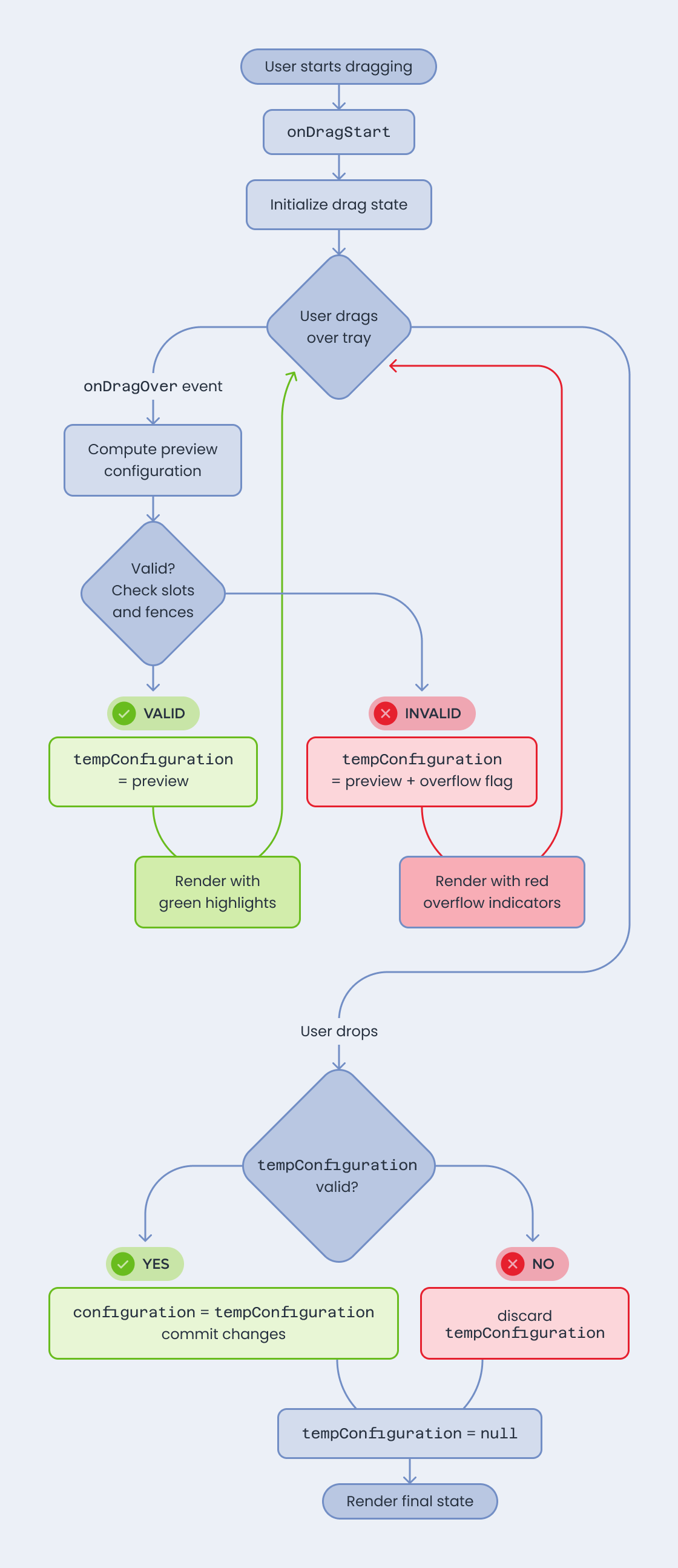
Initially, we only validated on onDragEnd. Users would drag a rack, drop it, and then see an error if it didn't fit. This felt broken: why let them attempt an invalid drop in the first place?
The solution was to recalculate the configuration in real-time using the onDragOver event. As the user drags over a tray, we compute what the configuration would look like if they dropped right now, and update the UI to reflect this. Empty slots light up to show where the rack would go, and if the rack won't fit, those slots turn red.
Here's the core logic:
function ConfiguratorRoute() {
  const [configuration, setConfiguration] = useState(initialConfig);
  const [tempConfiguration, setTempConfiguration] = useState(null);

  function onDragOver(event) {
    const { active, over } = event;

    if (!over) {
      setTempConfiguration(null);
      return;
    }

    // Compute what the configuration would look like
    const source = active.data.current;
    const target = over.data.current;

    const preview = computeConfigurationPreview(
      configuration,
      source,
      target
    );

    // Check if the rack fits
    const { totalSlots, availableSlots } = getTrayCapacity(preview);
    const rackSlots = source.rack.number_of_slots;
    const fenceSlots = computeFenceSlots(preview);

    if (rackSlots + fenceSlots <= availableSlots) {
      setTempConfiguration(preview);
    } else {
      setTempConfiguration({ ...preview, overflow: true });
    }
  }

  function onDragEnd(event) {
    if (tempConfiguration && !tempConfiguration.overflow) {
      setConfiguration(tempConfiguration);
    }
    setTempConfiguration(null);
  }

  const displayConfig = tempConfiguration || configuration;

  return (
    <DndContext onDragOver={onDragOver} onDragEnd={onDragEnd}>
      <DeviceList devices={displayConfig.devices} />
    </DndContext>
  );
}
The trick was maintaining two states: the committed configuration and the temporary tempConfiguration that updates on every drag move. When rendering, we use the temp configuration if it exists, giving users an instant preview. On drop, we either commit the temp configuration or discard it if it's invalid.
This approach had performance implications. Recalculating fences and slot positions on every drag event isn't free, especially with complex configurations. We optimized by using CSS style attributes directly instead of MUI's sx prop for transform and transition properties, which significantly reduced re-renders. We also memoized the fence calculation logic and avoided unnecessary clones of the configuration object.
Just when we thought we were done, the requirements evolved. Users needed to create multiple configuration profiles based on a default layout. The default layout trays should be sortable (users can reorder racks freely), but profile trays should only allow swapping — you can replace a rack with a different one from the drawer, but you can't reorder or remove racks because that would break the layout structure.
This meant we needed both sortable and droppable patterns in the same interface, and they needed to coexist without interfering with each other.
Our solution was to make the lane component adaptive based on context:
function Lane({ lane, isSortable = true }) {
  if (isSortable) {
    return <SortableRack lane={lane} />;
  }
  return <DroppableRack lane={lane} />;
}

function DroppableRack({ lane }) {
  const { isOver, setNodeRef } = useDroppable({
    id: `lane-${lane.id}`,
    data: { type: 'lane', lane }
  });

  // Show preview of what rack would be here
  return (
    <div ref={setNodeRef}>
      {isOver ? <RackPreview /> : <Rack lane={lane} />}
    </div>
  );
}
The challenge was that droppable lanes needed to know what was being dragged to show an appropriate preview. DnD-kit's context doesn't expose this directly to arbitrary components in the tree. We solved this by creating a custom DraggingContext:
const DraggingContext = createContext(undefined);

function useDraggingContext() {
  return useContext(DraggingContext);
}

function ConfiguratorRoute() {
  const [dragSource, setDragSource] = useState(undefined);

  function onDragStart(event) {
    setDragSource(event.active.data.current);
  }

  function onDragEnd() {
    setDragSource(undefined);
  }

  return (
    <DndContext onDragStart={onDragStart} onDragEnd={onDragEnd}>
      <DraggingContext.Provider value={dragSource}>
        <DeviceList />
      </DraggingContext.Provider>
    </DndContext>
  );
}
Now droppable lanes could access useDraggingContext() to see what rack was being dragged and show an accurate preview, including highlighting slots in red when the rack wouldn't fit due to different slot counts or incompatible fences.
We also added visual differentiation: sortable lanes show solid fences while droppable lanes show dashed borders, making it clear which areas allow reordering versus swapping.
After several iterations, we found ourselves wishing we'd known a few things from the start. The biggest time-saver would have been starting with the sortable preset immediately. We built manual slot management with core that sortable handles automatically — a week of work that became unnecessary once we discovered the preset. Even if your use case feels "too custom," sortable likely supports it.
Performance became a concern as our configurations grew more complex. Drag operations need to feel instant, which means being deliberate about where computation happens. Switching from sx to inline style for animated properties, memoizing calculations, and avoiding unnecessary object clones made the difference between sluggish and responsive.
The real-time preview system took significant effort to implement, but watching users work with it validated every hour spent. There's something fundamentally satisfying about seeing immediate feedback — empty slots lighting up to show where your rack will land, or turning red when it won't fit. The onDragOver approach adds complexity, but the UX improvement is undeniable.
We also learned to lean heavily on DnD-kit's data system. The ability to attach arbitrary data to draggable and droppable elements through the data property became central to our architecture. We passed lane configurations, device references, and validation metadata this way. Using TypeScript discriminated unions to structure this data proved essential for catching bugs before they reached production.
Building this configurator taught us that DnD-kit is impressively flexible, but it requires understanding its different layers and patterns. Starting with @dnd-kit/core gave us fine-grained control, but discovering @dnd-kit/sortable showed us how much the library can do when you use the right abstraction level.
The key insight is that DnD-kit provides building blocks, not a complete solution. You'll need to design your own state management, validation logic, and preview system. But those building blocks are solid, well-designed, and composable in ways that let you handle complex requirements like mixing sortable and droppable patterns.
The configurator is now in production, helping laboratory technicians plan and validate rack configurations before ordering physical hardware — exactly the kind of problem where getting drag-and-drop right makes all the difference. If you're interested in tackling these kinds of challenges, whether you're building something similar or want to work on projects like this, we'd love to hear from you.
Tap by Designer Zepeto from Noun Project (CC BY 3.0)

Pedro is a full-stack Software Engineer at Buildo, with a strong inclination toward frontend development and complex UI challenges. He combines technical precision with a curiosity for new tools and approaches, always looking for ways to raise the bar on code quality and developer experience.
Stai cercando un partner affidabile per sviluppare la tua soluzione software su misura? Ci piacerebbe sapere di più sul tuo progetto.

Buildo S.r.l. è certificata ISO 9001:2015 (Sistema di Gestione Qualità) da PJR per la Progettazione e Sviluppo di Software.


